You already know that the presentation of your business is important. That's why you take great care in the user experience of your website, the visual appeal of your logo, and anything else that's made to pull in the crowd.
All of this is well and good, and you've done a good job checking off all of the important areas. Well...almost all.
The design of your app icon is easily one of the most important things that your business should focus on, and for many reasons.
We'll go in depth as to why you need to take care of it - and how it can boost your number of clients like never before.
The Explosion of the App Icon
If we want to get technical with it, apps have been around for decades. They've made it easier for users to log onto their computers and get to the internet, Microsoft Word, or even Minesweeper (yes, that's still a thing).
However, if you take a look at the apps of the past, you'll notice that they all have something in common; their icon design kind of sucks.
You could say they did the job; after all, many of us at the time were just happy to have a user-friendly computer at all, so the way the icons looked didn't really matter so long as we could navigate the application itself.
However, that was then, and this is now.
And those of us living in the now want to have apps that look pretty.
Here's the deal: thanks to technology, humans have become 1) impatient about pretty much everything, and 2) completely obsessed with the visual side of things. These to traits are what makes app icon design so important.
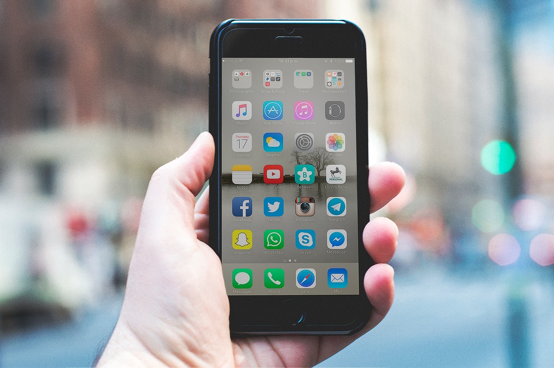
In most cases, the first thing that people see when they stumble upon your app is the app icon.
If the icon looks good, they'll be curious to learn more or even download it. If it doesn't, they'll frown and keep scrolling.
All of this is determined within seconds, and you either get it right - or you don't.
Now that you know how important icon design really is, you need to know how to make yours stand out from the crowd and be worthy of the people's time.
Make the Design Recognizable
One of the most important things about your app design is that it needs to feel familiar to the consumer. The more recognizable the icon is, the more willing they will be to download it.
It helps to think of it like how you designed your company logo.
When people see your logo, they see something that's synonymous with your company. No matter where they see it, they can recognize it and relate it to your wares.
The same can be said about your app icon design. You want to have a design that's recognizable to people and that they can relate back to your company.
This doesn't mean that your icon has to look like your company logo; far from it, actually.
You can design it how you wish, but it's highly recommended that you go for a look that makes them think about your company in some way.
Know Your Audience
It pays to know who your audience is, especially when it comes to designing your app.
Your company is a business that wears many hats. Because of this, you may want to have a different icon to reflect those specific consumers who are using it.
A perfect example is how Google Play has designed all of its subcategory apps.
Each of those apps (Google Play Games, Google Movies, Google Books, etc.) has a bit of the Google Play design in them, but with their own looks that tailor to their specific audience.
This is a very solid idea to draw people in, as it shows to them that your app is specifically tailored to what they need at that time.
Those searching for that app will be able to trust it just because it looks like it's tailored to what they need.
Don't Overdo the Details
Many artists may be fans of adding extra detail to their work. However, with icon design that really doesn't need to be the case.
Apps can only be so big because they're made to fit on a smaller screen (i.e. phones and tablets). With that being the case, having a detailed and intricate design may actually work against you.
What your design looks like during the creation process will be shrunk, usually to a 1x1 square on a device. The details will simply make it look like a mess, and that will make any potential consumers think you can't do your job right.
To prevent this, you can just keep the design simplistic in its appearance. For example, if you're making an app for buying virtual books, you can create an icon that shows a simple 2D outline of a book instead of a complex 3D drawing.
The simplicity will attract users and will look better on the screen, making it seem much more trustworthy to them - and they'll be sure to download it.
Ready to build your app icon design so you can wow the crowd? Why not work with these masters of app development? They're sure to give you the results that you need to stand out from the pack and get the clients you want.
Because Art Design Is a Big Deal
Now you know why the design for your app icon is super important, and you'll want to focus on making yours better. Why not find out what else you can do to soup up the creative side of your business?
Our site has loads of free tutorials you can try to learn about all sorts of new things using Photoshop software. Learn how to add 3D effect, special abstract designs, texture and patterns, and so much more.
If there's anything you feel we should talk more about, please don't hesitate to let us know. We're always looking for the next big topic, and you could help us to post something new. Looking forward to hearing from you soon!