
Welcome (back) to Photoshop Lady. Thanks for reading!
In this intermediate Photoshop tutorial we will be walking through the making of an interesting, creative advertisement poster. This is what I would consider great for advertising your newest product, or just getting some design practice. I will not be explaining the function of every tool in Photoshop used in this tutorial, instead I will be walking through the design process (if you could call it that, anyway).
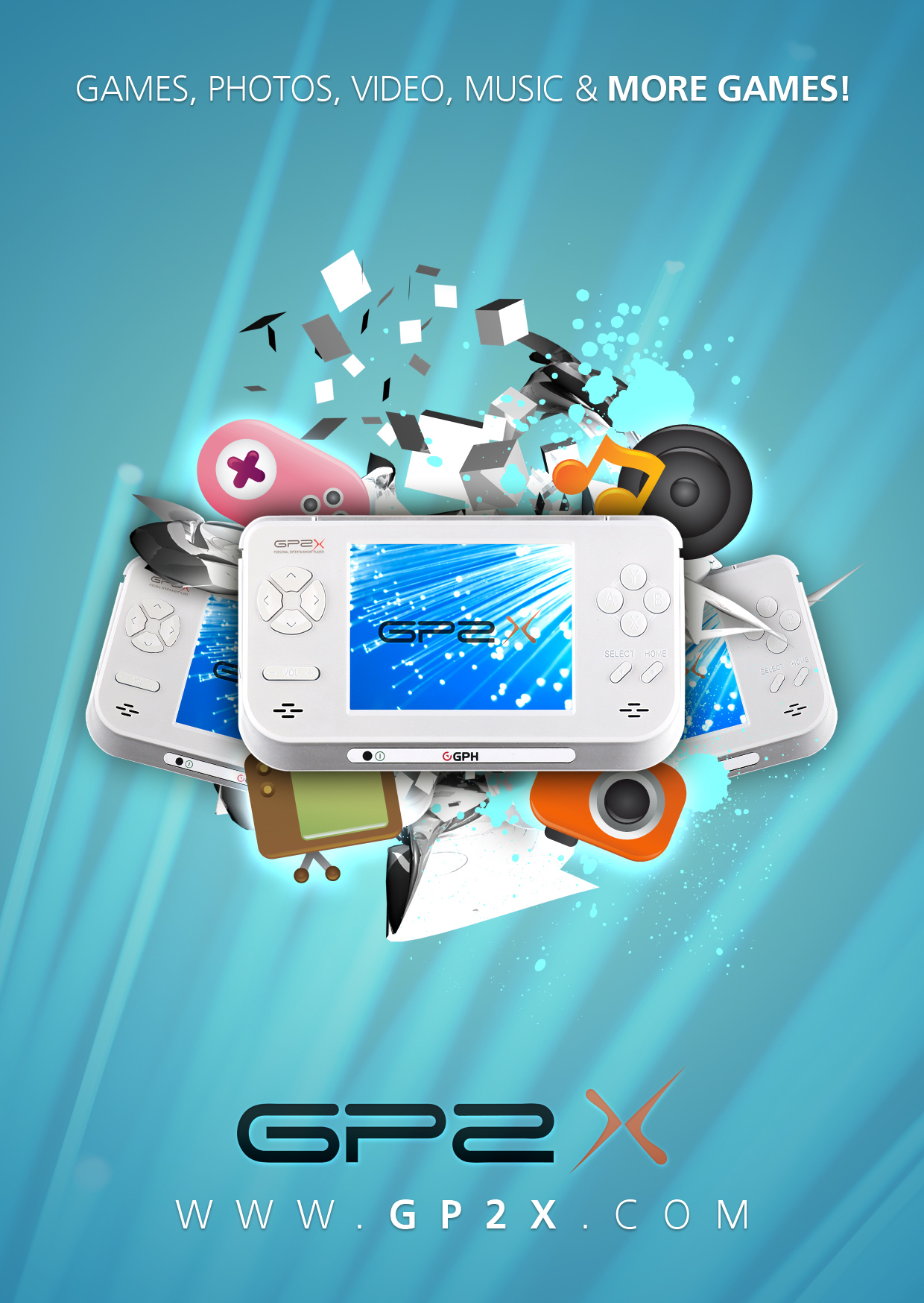
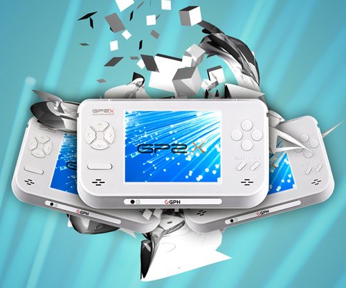
Here is our end result:
About the Author
Eli is a young and aspiring web designer from South Australia.
Inspiration
Before starting, you may want to locate some inspiration for your design. Here are just a few great places for finding design inspiration:
deviantART (Designs & Interfaces)
depthCORE
Designflavr
Smashing Magazine Inspiration
Web Design Inspiration
And there are plenty more sites out there where you can get inspiration, just take a look. You can even get inspiration from stock sites such as iStockPhoto and Vector Stock.
1. Setting up the Canvas
When creating a new document (File > New), you may want to use a Preset size. I selected International Paper > A6. This is just for practice, so we want to keep it fairly small and RGB as the color mode.
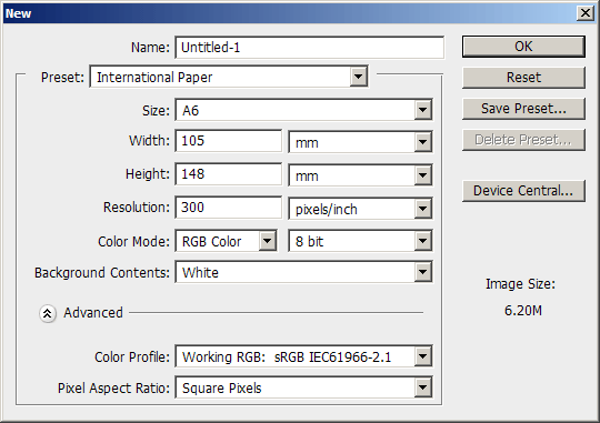
Resolution should be at 300, unless you want to change it. To fit the document nicely on your screen you will probably have to zoom out to around 33.3% of the document size.
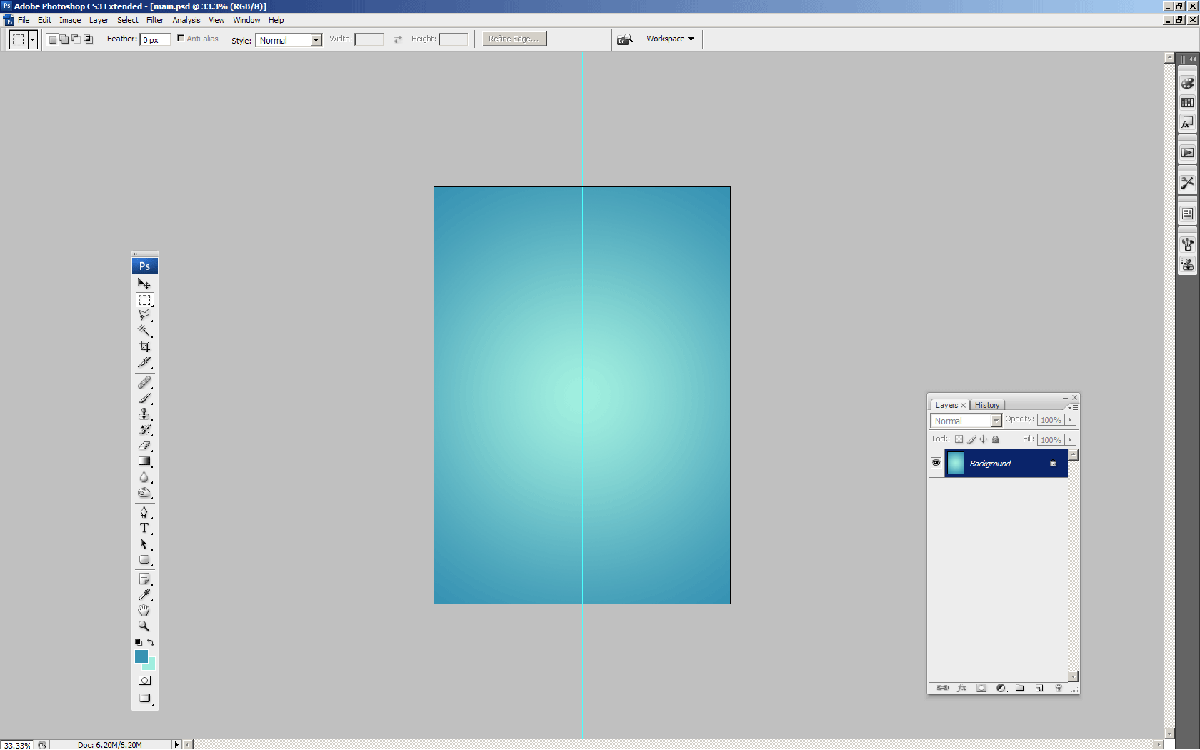
2. Creating a Basic Background
For our basic background we’ll just be using a radial gradient. Locate and get out the gradient tool, then set your settings similar to these:

The colors seen in the above image are: #a2f0e0 and #3793b3. All done? Create a radial gradient in the center of your document. I recommend you draw some rulers onto your canvas so you can find the center easier.
2-2. Additional Background Effects
Now we want to upgrade our basic background a little bit. You can do this by adding a simple texture in there then messing with the layer mode(s) and opacity. First, head on over to Katanaz-Stock on deviantART and download the Light Texture 03 image.
Copy this image onto your canvas, resize/rotate it if you like, then change the layer mode to Multiply and lower the fill/opacity to something very low, 10% for example.

Duplicate your texture layer once, change the layer mode to Screen and put the opacity up to 50%.

Now, we still have a fairly basic background, but it’s much nicer than just a gradient.
3. Choosing your Product
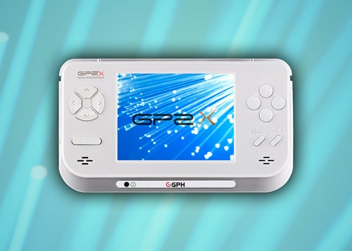
Now you need to decide what sort of product you want to promote in this design. It could be a cell phone, a gaming console, something fashion-related, or anything really. I’ve gone with something a little more unique for this tutorial, a GP2X F-200.
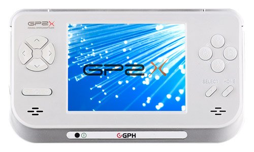
Head over to Google Images and search for a large or an extra large image of whatever product you want to use. I was lucky enough to find a pretty decent, extra large image of a GP2X.
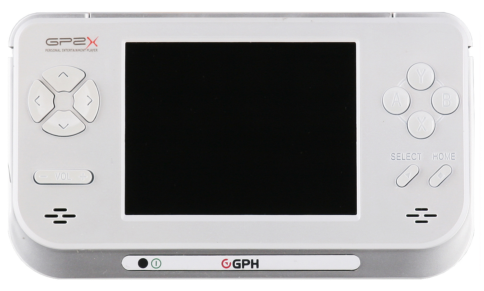
Click the above thumbnail for the fullsize image that we’re using.
3-2. Touching up Product Image(s)
Part of the job is touching up product images and making them suitable for placing in your main design document. As you can see, the image I’ve chosen has some noticeable blotches, blemishes, etc. so let’s try and remove them using the Clone Stamp Tool. There are a few different tools that you can use to remove imperfections, but I’ve found the Clone Stamp Tool works just fine (maybe even best), in a case like this.
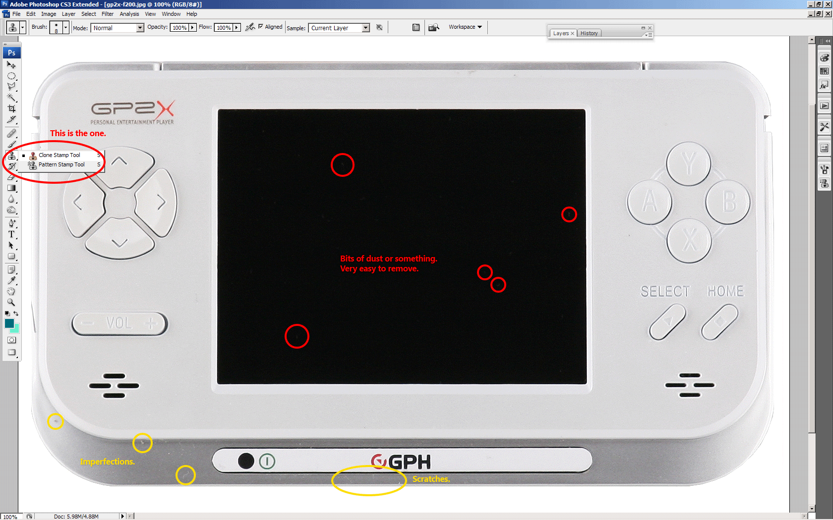
If you’re not too fond of what we’re doing in this step, you can of course just download the PSD file at the end of the tutorial and use the cutout, although you won’t have learned much!
After you have touched the image up, we need to cut the product out from the background. Since the product is very light grey on a white background, you can’t simply use the Magic Wand Tool, can you? So we’ll have to use the Pen Tool to make a very clean, precise selection around the device.
Obviously I can’t really walk through you through the entire making of the path, so if you’re a newbie with the Pen Tool and making paths, I recommend you read this advanced tutorial on the Pen Tool.
Optional: after you’re done you may want to add a colorful image into the screen of your product.
4. Product Placement
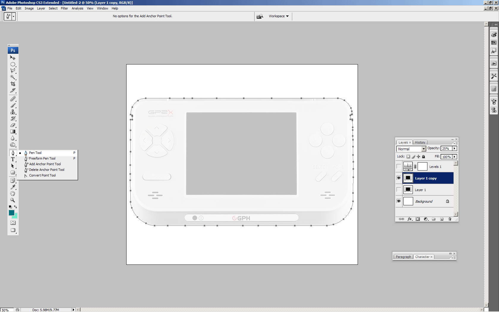
After you’ve made all of your touchups and cutout your product, copy it over your other canvas. If you’re running a newer version of Photoshop (CS3 I think), you should be able to convert your layer to a smart object, so you will be able to resize it, rotate it and resize it again (over and over) without losing quality.
So, if you’re on a newer version of Photoshop, right-click your product layer and convert it to a Smart Object.
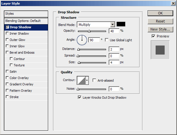
Using Transform Mode (ctrl+t), size your product down to something more appropriate and then position it accordingly. To bring your product off of the background, you may want to apply a basic drop shadow via an Outer Glow layer style.
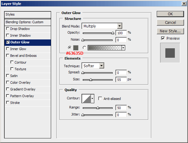
Duplicate your GP2X layer twice, rotate one -15.0 degrees, and the other 15.0 degrees using Transform Mode (ctrl+t). Position your new duplicates accordingly, and size them down a little if necessary. You have to use your own imagination here.
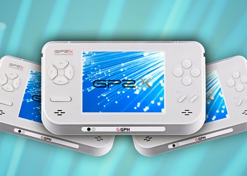
Both duplicates have a similar Outer Glow layer style applied to them, except using a lower opacity.
5. Abstract Elements
To make our design “pop” we’re gonna use some abstract elements.
Using Cinema 4D I managed to muster up a basic but cool abstract render using the GP2X image as the texture. Using this render we’re going to make our design look a whole lot more interesting.
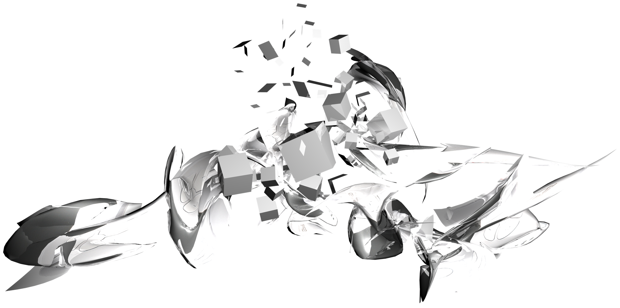
This is how I made use of the 3D abstract:
1. Start by copying it to your canvas, make a few duplicates.
2. Rotate/resize/position your render(s) underneath the product, then erase away the parts of the render that make the overall design look worse than better.
3. Repeat 1-3 times.
And now I have this:
Now that looks much better! If you look around for some inspiration, or in some magazines for creative cellphone ads, you’ll notice these ads have a similar design style going on. The idea is to get some creative elements behind the product/around the product/maybe on top of the product.
6. Vector Elements
I still think our design is a bit boring, so let’s find some vector stocks. Check out the freebie websites such as Vecteezy and find some vectors. Or you can go to iStockPhoto/Vector Stock/Go Media and get some premium vectors.
To start off with I just used two simple splats with a light, sky-blue color (#87ffff), but it should be very easy to find a free brush that will do the job of these vectors just fine.
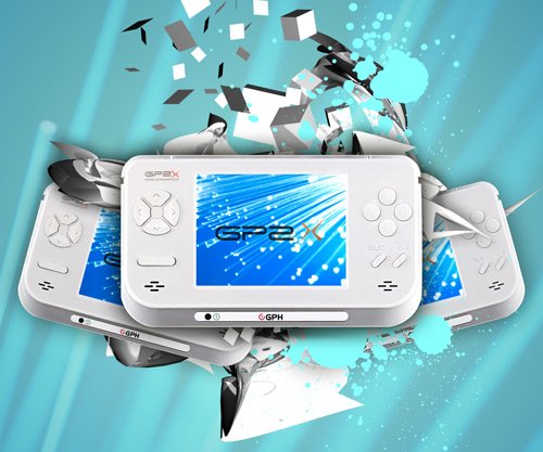
Next, I used a set of vector icons that I bought a while back from Vector Stock for just one credit (one dollar!) to place underneath the product. This is what I’ve got:
![]()
This may look better or worse in your opinion, so please feel free to do whatever you like with the design to make it according to your tastes.
Note: the icons in the above image have an outer glow applied to them, using a light color and Linear Dodge as the blend mode.
Another note: for some reason I’ve been unable to locate these icons again on Vector Stock, otherwise I would have linked to them. I’m sorry if this is an inconvenience.
7. Logo/Text
If possible, find a large version of the logo that belongs to the product you’re trying to promote here. Copy it onto your canvas and resize it to an appropriate size.
![]()
Optional: lower opacity and apply layer styles to add extra effect to the logo.
![]()
Next, add in some text describing your product.
Top text, description:

Bottom text, website URL:

The font used here is called Frutiger, it’s a commercial font rather than a free one, so you may want to find a suitable alternative. The text you can see in the above images also have a slight Drop Shadow layer style applied to them.
8. Finalizing
Finalizing the design is up to you. You need to add your own touches to this design to make it perfect. I don’t think I did anything to it that wasn’t stated in the tutorial! Some ideas would be to change the color of the document using some adjustment layers (add more contrast using levels adjustment, etc.)
A good idea would be to add some more color, so if you like, create a new layer, select a large, soft brush and make a few blobs on your canvas using different colors. Change the layer mode to something such as Color Dodge or Overlay.
Subscribe to Photoshop Lady
If you don’t want to miss any great articles or tutorials, please subscribe to Photoshop Lady via a feed reader, or via email updates!
Thanks for reading the tutorial, I hope you enjoyed it.